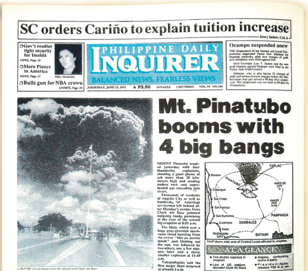
From spontaneously hysterical to curated flow of information, today’s radical redesign is the latest development in the Inquirer’s 30 years of evolution as an agent of the free press and the source of essential information for the Filipino people.
Delivered to the national consciousness in a snap on Dec. 9, 1985, the Philippine Daily Inquirer was put to bed minus the technology resources and woke up to the realities of press deadlines with no time to fuss over makeup. The newspaper began dishing it out in daily doses, cramming as many as 16 stories on it’s front page. It was a time when events unfolded before the printing ink could dry.
Bucking birth pains, the Inquirer perfected the look of an unmade bed “in keeping with the sizzle of the times” with such consistency that it metamorphosed from a mosquito press that was taking small bites at the martial law government into one aptly described as alternative. In the post-Edsa years of a robust free press, print was king as Inquirer delivered the news that “needed to be said” with radio as media partner, following to read from the newspaper accounts.
Soon, the incidental cartoons of Jess Abrera became the distinguishing feature of its front page. It started when then editor in chief Louie Beltran posed the question to then publisher Eggie Apostol, “How do we illustrate a story that goes: ‘Cory, a snake in our garden of Eden, says FM?’” Thereafter, a wise-cracking carabao animated the daily news and became a signature feature on the front page, up to the present.
The Philippine Daily Inquirer, being the symbol of newfound press freedom, continued its “Balanced News, Fearless Views” as it complemented the breakout of news on TV. The broadsheet churned out extras and late editions to keep up with the pace of news.
Constant flow
Things began to change with the arrival of the World Wide Web and, with it, paperless reading. The digital age ushered new publishing technologies in 1994 to replace the cut-and-paste method. Paste-up artists discarded their stripping knives to learn to push keys and buttons. New software enabled page editors to more accurately fit text to layout. A designer had to be called in to clean the clutter and put some method in charting the news.
The introduction of design saw the transformation of a sleeker nameplate or logo and the unearthing of a page architecture long buried under the pile of news. From spontaneously hysterical, reading the news on print became a charted reading journey.
Despite viewers turning to the evening TV news for the latest news update, print remained the medium of choice to complete the storytelling the morning after.
The year 1998 saw the Philippine Daily Inquirer rearmed its agenda-setting role as the No. 1 most-read broadsheet, with the shift from monochromatic front page to full-color, in time for the celebration of the Philippine Centennial. The Inquirer nameplate dropped the multilinear background in favor of a seamless gradient backdrop.
Inquirer met the challenge of the internet head-on as it partnered with GMA TV to put up a news website called Inq7.net in 2001. When it had become apparent that the internet’s paperless read- ing novelty was making it more costly to put out the newspaper printed edition, the Inquirer, like all other big newspapers all over the world, embarked on “Project Big” to merge reading comfort and publishing economics by redesigning its layout and dimensions. Inquirer slimmed down to a narrower width, saving on paper, but using less space in a smarter way.
One-Brand reformat
Design stepped up to the plate when it was becoming apparent that the news- paper of information was transitioning into a viewspaper of perspectives, producing commemorative front-page editions.
As technology continues to limit the pace of how news traveled, the Philippine Daily Inquirer opens a new chapter in its rich history as it embarks on a One-Brand reformatting across multimedia platforms, in rhythm with the two tem- pos for storytelling in the digital world.
In the first tempo, readers will get 24/7 constant flow of information through the Inquirer mobile, radio and website. In the second tempo, the curated news– comprising of carefully crafted words and images, edited and art-directed with deeper perspective and longer time frame–will be carried in the print and digital edition.
The viewspaper that has become part of your morning habit for more than 30 years will continue its flagship role in the Inquirer media quartet through changing times and technologies: that is, provide the visual surprise in a news-as- usual day.
Go to https://my.inquirer.net to experience the most engaging Inquirer yet.
